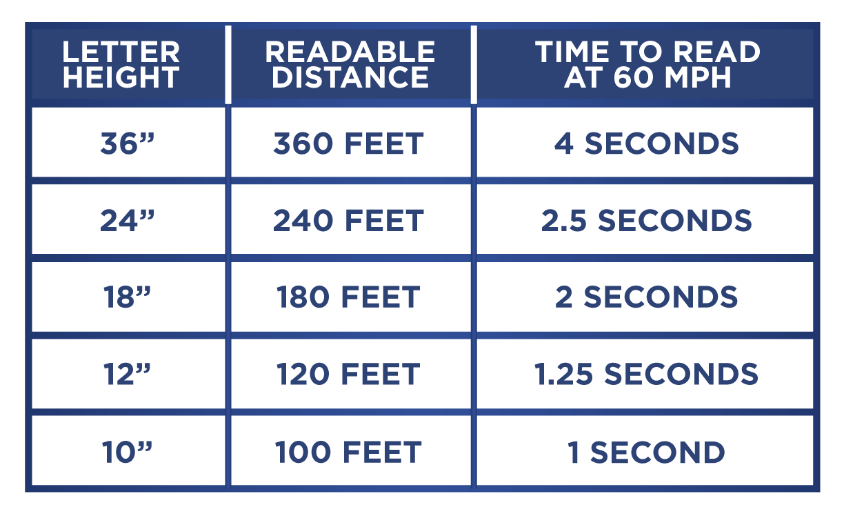
Size matters! Font size determines what will be read first, last or not at all in the hierarchy of the copy. The most important information in the copy should be the largest to ensure it is read first. As shown in this chart, font size is about read time. The smaller the font, the closer you must be to the billboard to read it. Don't run out of time!
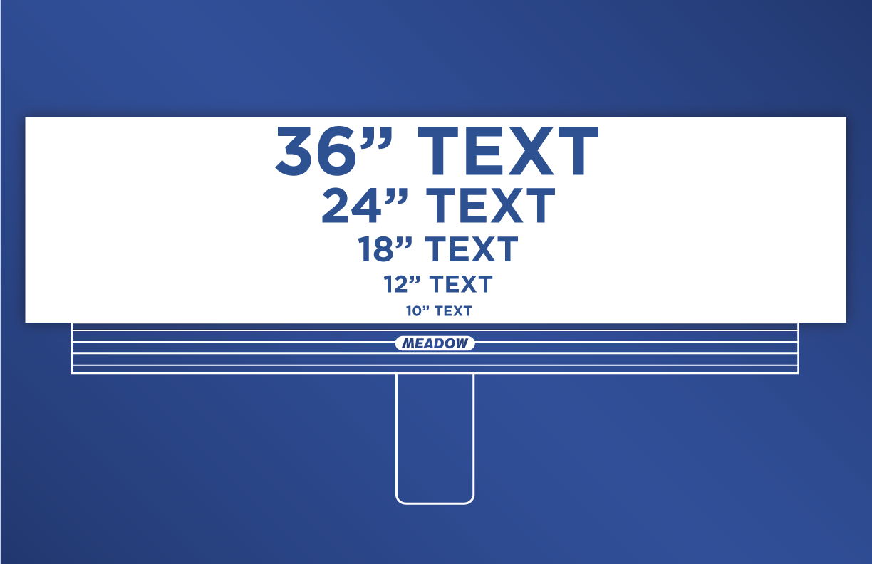
The illustration to the left shows how letter sizes will appear from 300 feet away, simulating a billboard on a highway. Surface street billboards allow the smallest font size, but reducing font size reduces impact so care should be taken to maximize letter height over word count.
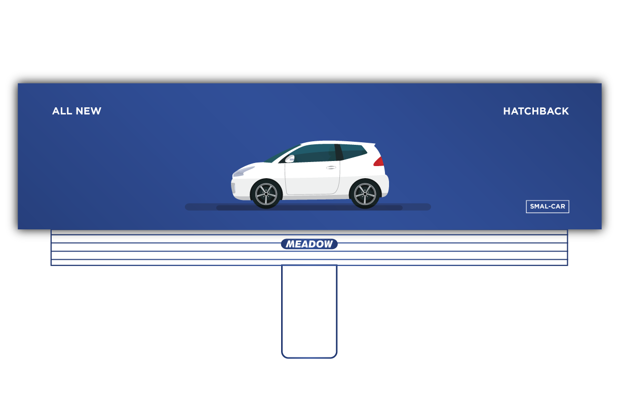
The Magazine Ad: Print advertising can utilize the “white space rule” which allows open space for visual effect. The same style of ad becomes a challenge to read at billboard scale.
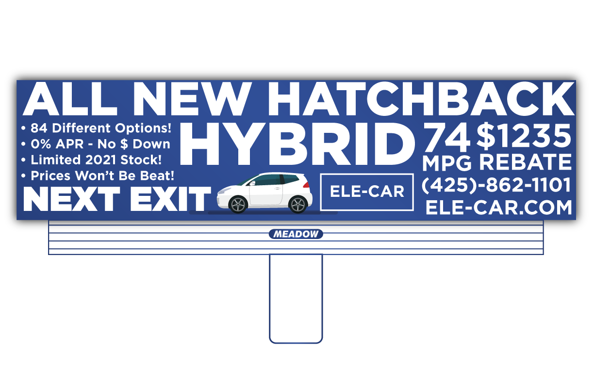
Excessive Copy: The temptation to include too much information forces the use of small letter sizes resulting in unreadable text and a confusing message. The outdoor rule of thumb is “Seven Words or Less”.
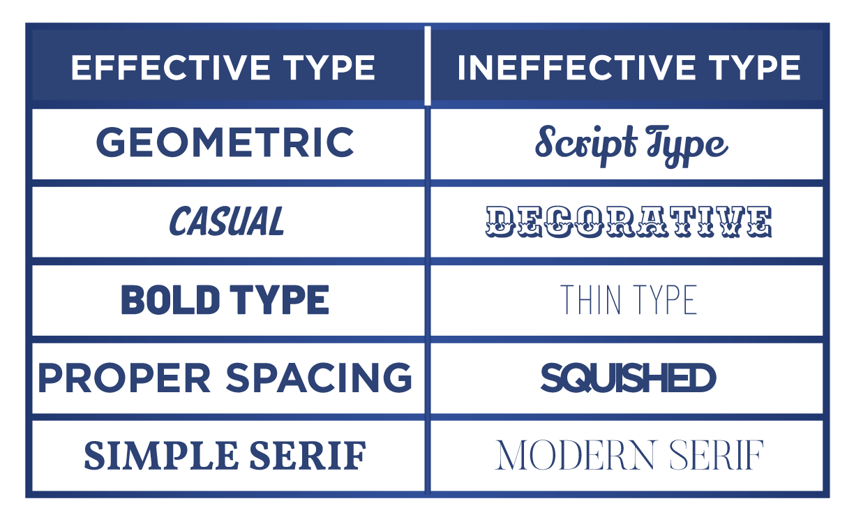
Good fonts read quickly and don’t require valuable time to discern. They are uniform and evenly spaced. At a distance, ineffective fonts that are fine or detailed will fade into the background. Heavy fonts will blend together and lose their basic shape. We select fonts that highlight the brand style but emphasize good reading qualities.