Top 10 Creative Q1 2026
Every quarter, we love to show off some of our best designs to provide inspiration for other artists!
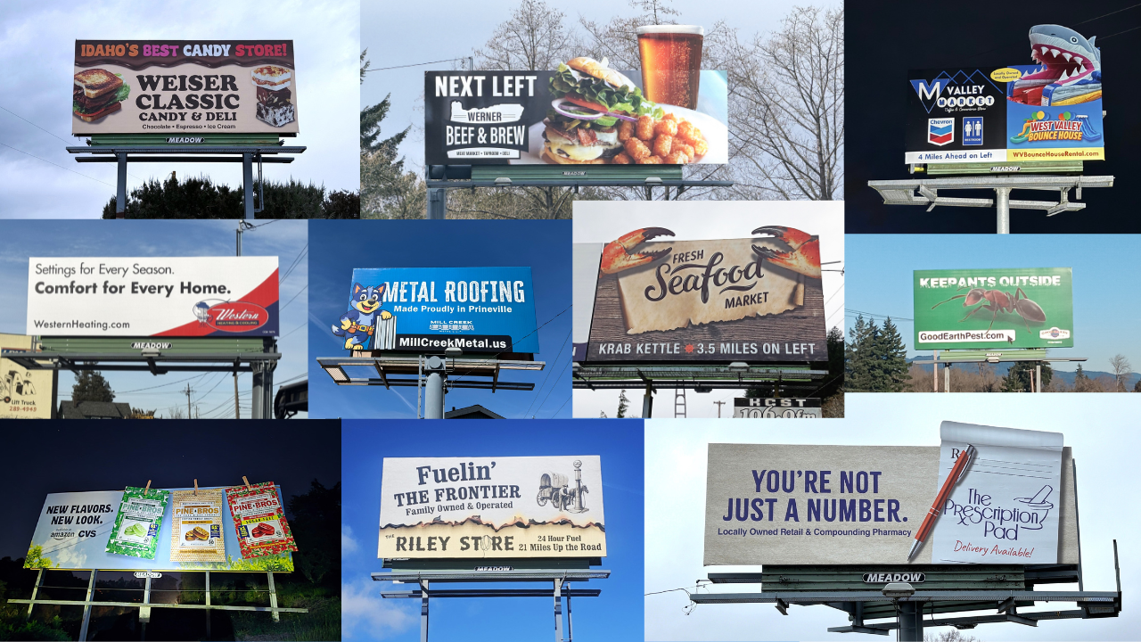
10. This design immediately communicates the draw for the business, candy! It relies on viewers Googling the name of the store rather than listing a contact method, which is a more effective choice. It also utilizes bright colors, which make it really pop against the natural scenery.
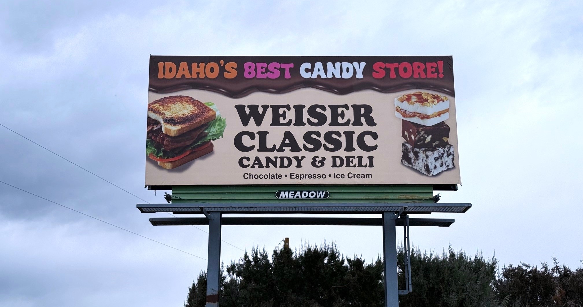 9. Werner Gourmet Meat Snacks: If it ain’t broke, don’t fix it! This design was so good that our client wanted to reprint it and go with the same design. The food would make anyone’s mouth water, and the logo and direction will get you where you need to go!
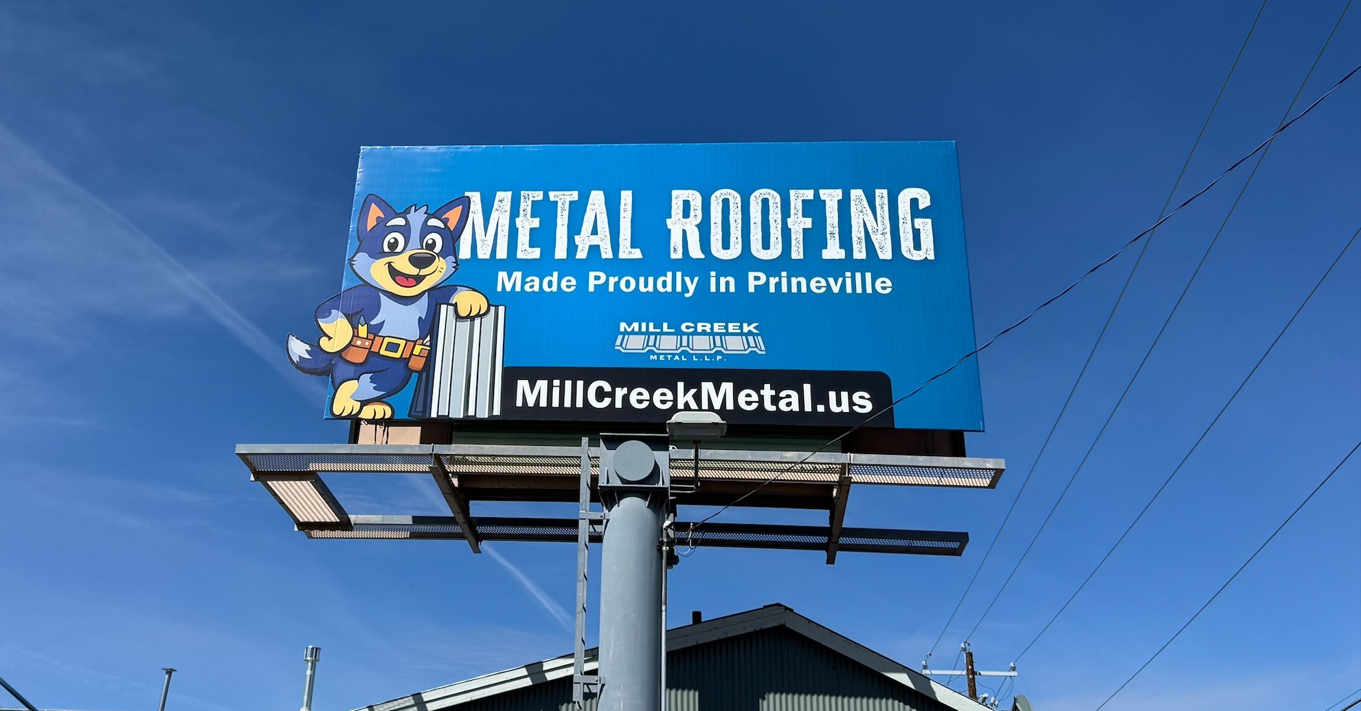
 8. Mill Creek Metal: This display catches your attention with a cute business mascot as a side extension and communicates to the viewer the brand identity quickly with a rough, jagged font.
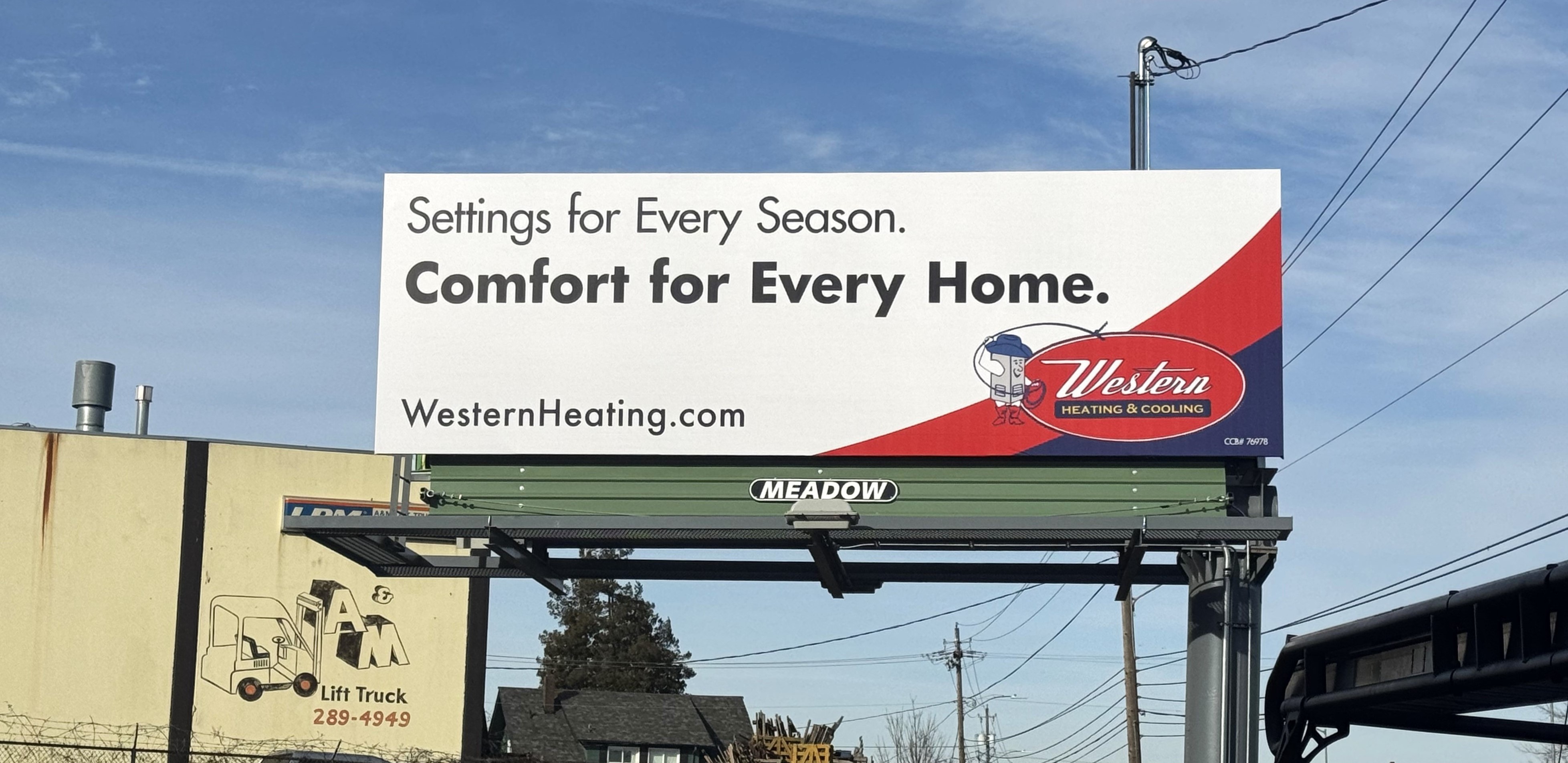
 7. Western Heating & Cooling: This design is not crowded, directing the eye to its simple but punchy elements. Its colors contract very well, and it has a concise contact method that will be easy to remember for potential customers.
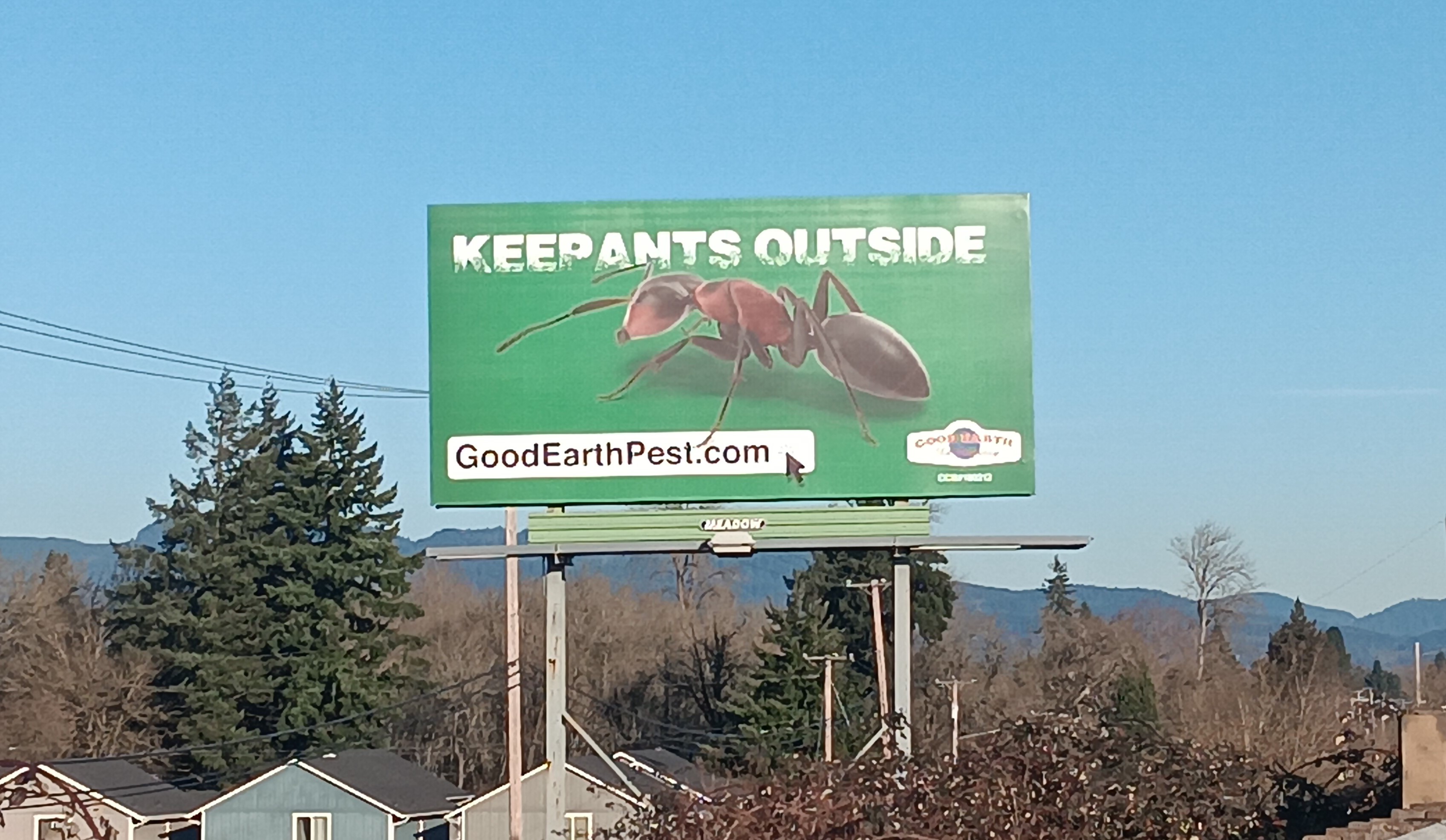
 6. Good Earth Pest: This billboard follows the quintessential rule of billboard design: use 7 words or less. It is simple with a decent amount of negative space, which gives the design room to breathe. The enormous ant is a perfect visual; it’s sure to draw attention and be memorable.
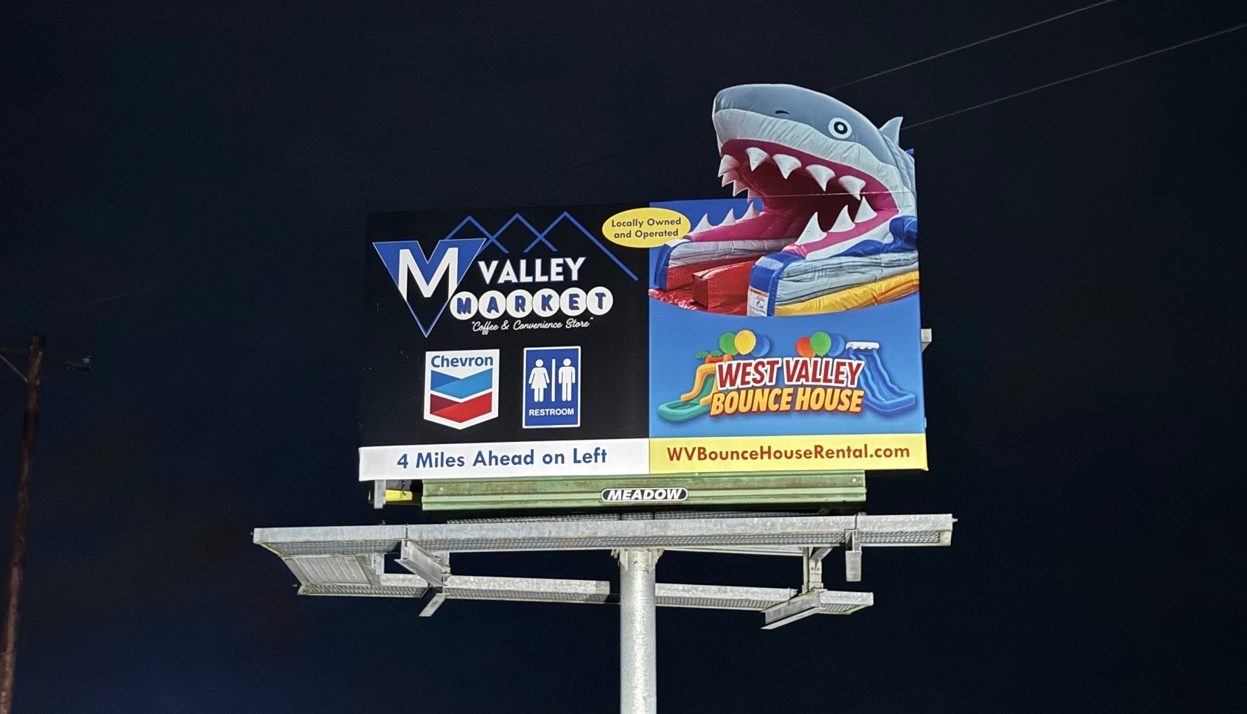
 5. Valley Market: Designing a small display that is then further divided into two sides for two different advertisers. However, our Creative team rose to the occasion, delivered two distinct brand identities, and effectively emphasized the entire display with this unique inflatable shark extension.
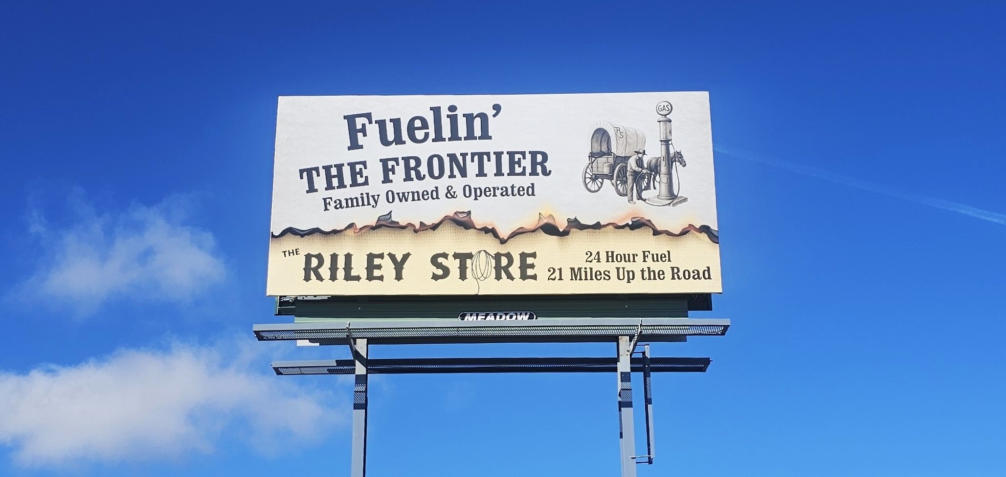
 4. The Riley Store: This display perfectly communicates the western vibe of this business without needing to express that in the copy. Its visual elements are subtle, but combined, they make a very fun display!
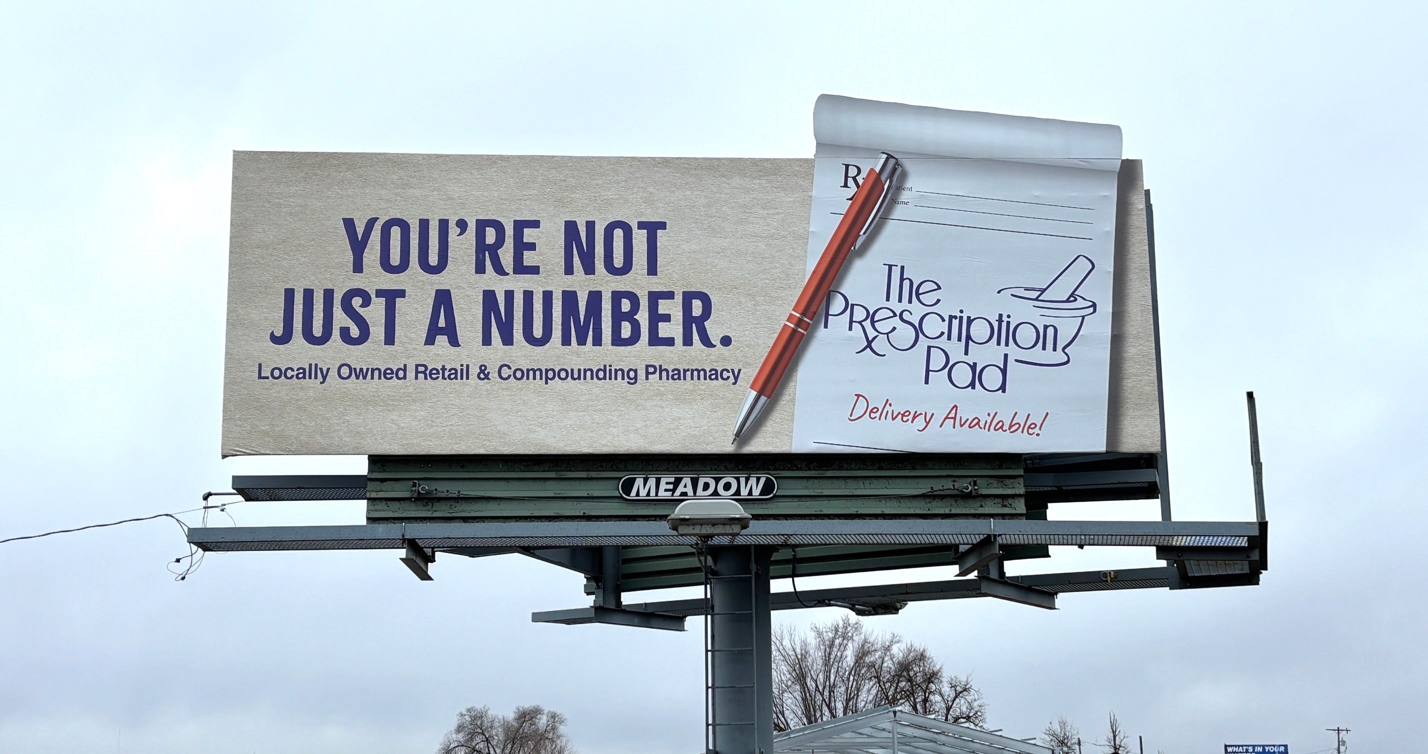
 3. The Prescription Pad: Using a visual element that helps the viewer remember the name of the business was a stroke of genius from our creative team! In this case, they made a Prescription Pad the most dominant aspect of the display for a business called The Prescription Pad. That, combined with the bright, contrasting colors and simple, bold copy, makes this billboard a winner.
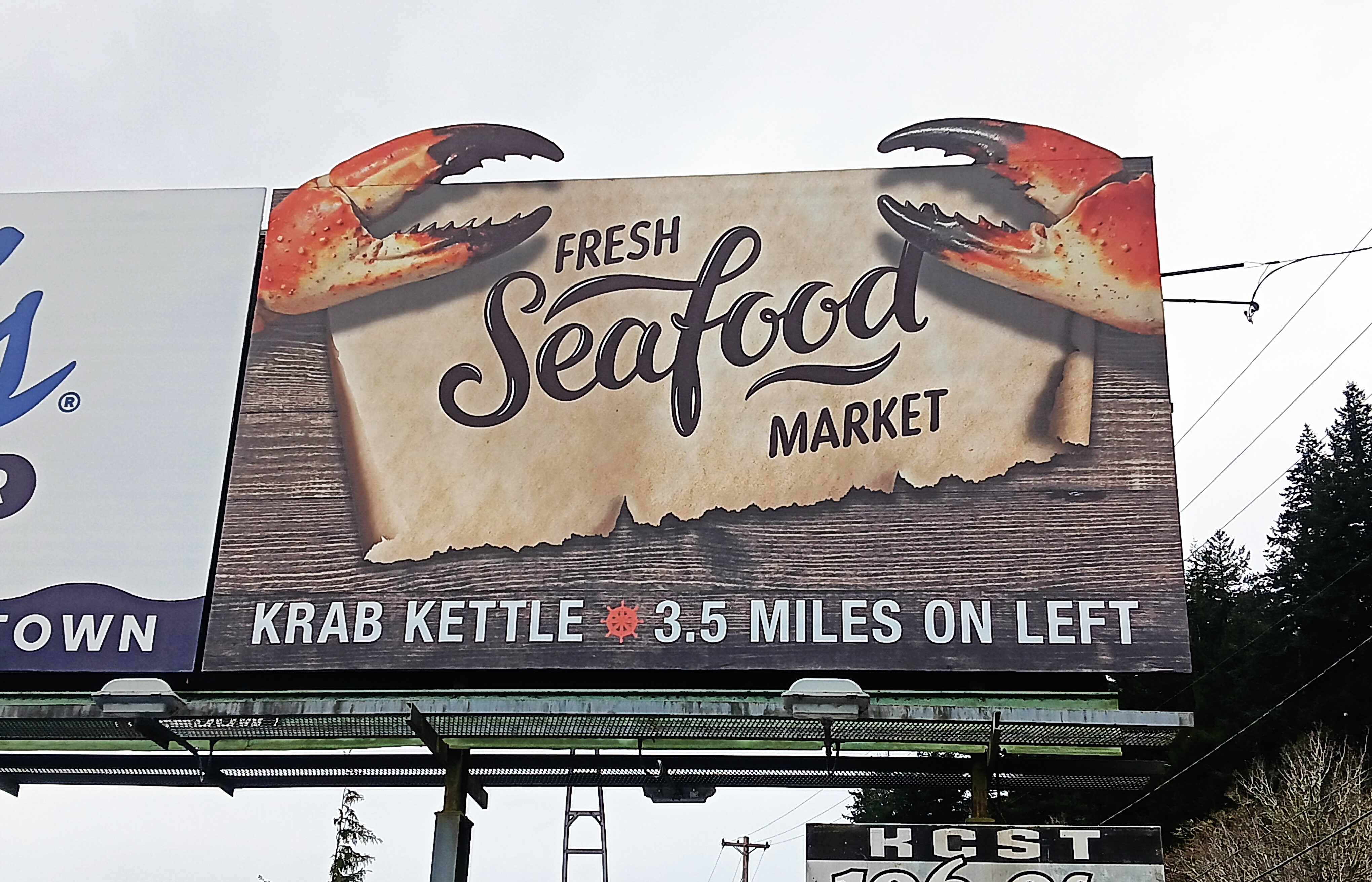
 2. Krab Kettle: This display is completely saturated in the business’s coastal brand identity. The crab claws, the woodgrain background, the weathered map, and the tiny ship’s wheel all scream seafood market. The bright orange claws pop against the rest of the elements, and as extensions, they all pop against the gray coastal sky.
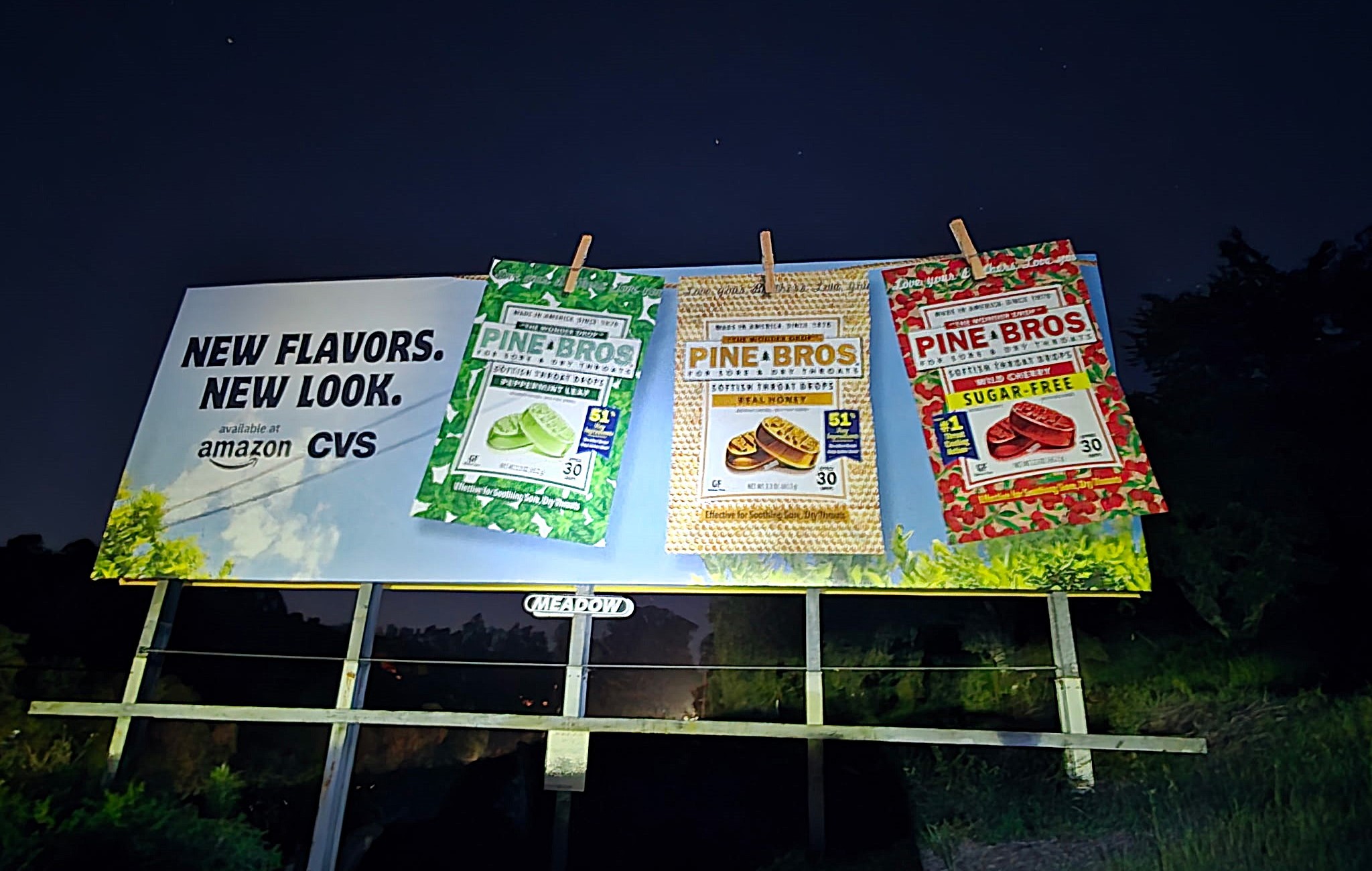
 1. Pine Bros: Creating an outstanding design is difficult, but convincing a customer to use that outstanding design might be the most difficult part. Our Creative team managed to sell the customer on this fantastic design with three small extensions. Go to our LinkedIn post to read more about this story!
 Happy designing!
If you are interested in advertising on one of our billboards call us at 800-221-4114 or email us at meadow@meadowoutdoor.com!