
How Hierarchy Can Energize Your Billboard Design
Hierarchy is subtle, not as evident as color contrast or other design elements, but it can take a good billboard design and make it great.
Hierarchy is defined as laying out visual elements to show their order of importance according to how they will be read. Copy with the largest font will be read by the eye first and flow through to the smallest copy.
The Meadow sales team will ask relevant questions in an art interview to help our clients identify copy hierarchy and relate it to the artists. Should we highlight your company name, contact information, and maybe a tagline? You choose it and we can bring attention to it.
Hierarchy can be accomplished in several different ways. The first is simply the relative size of the element on the billboard. Another way is adding weight to the text by making it bold or increasing the kerning (spacing between letters). A third way to create hierarchy is to give the most important information the most contrast and decrease the contrast as you go down the list of priorities. Billboard artists should never create extremely low contrast designs, however, small decreases in contrasting value can be done well when it’s done intentionally.
 This can also be accomplished by placing the most important information in the top left-hand side of the design. The human eye travels across any layout in a specific way, starting at the upper left corner, traveling to the upper right corner, then down to the bottom left corner, then finally over to the bottom right corner, in a ‘Z’ shaped pattern. Therefore, anything you want to call attention to should be in one of those four locations with the most important element staying in the top left corner. There are exceptions to this but it’s a good rule of thumb.
.png)
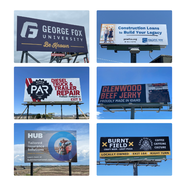
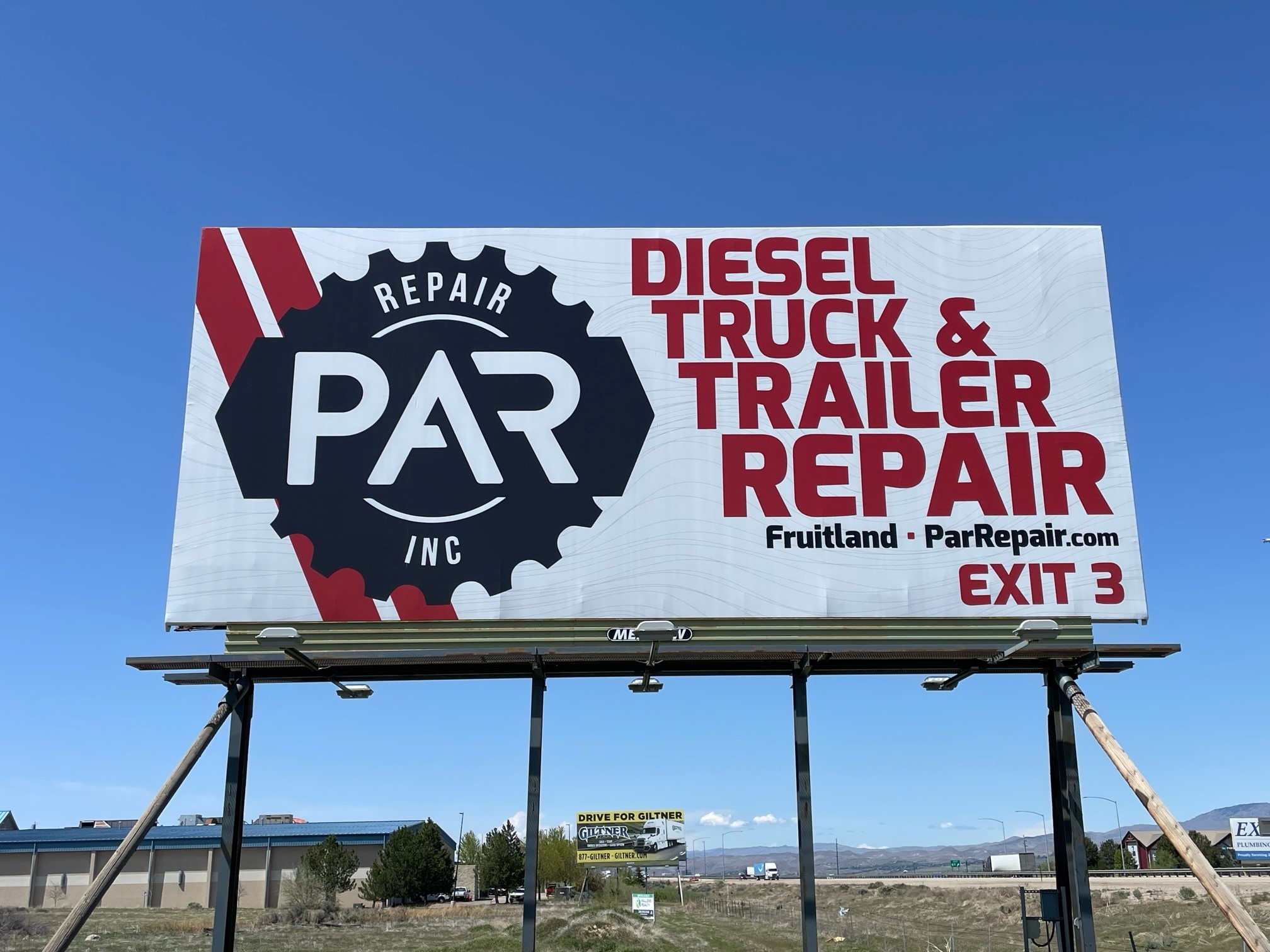 A great example from the Meadow design archives is this PAR Repair, Inc. billboard in Boise, Idaho. The logo and name of the company is the largest item located in the left upper corner, and within the logo, the name ‘PAR’ is placed first within the hierarchy by size. Then on the righthand side of the billboard is a set of offerings ‘Diesel, Truck, & Trailer Repair’, each word increasing in size as it goes down, focusing on the last word ‘Repair’, which is the key point of all the offerings. In combination, the logo’s main word ‘PAR’ and the text’s main word ‘Repair’ spell out the company’s full name and is what people will likely Google to find this business. Also, the offerings list clearly has decreased kerning allowing space for the increasing font size. Thirdly, there is the exit number in the bottom right corner. The smallest and by far the least important information is that this company is located in Fruitland, Idaho, and can be found at ParRepair.com, information that can easily be found with a quick Google search. This ad is a masterclass in using hierarchy to give the design dimension and make sure that potential clients notice the name of the company!
Meadow will provide artwork for any of its clients that request it on static or digital billboard faces. Please reach out to us for any questions regarding our artwork!
If you are interested in advertising on one of our billboards call us at 800-221-4114 or email us at meadow@meadowoutdoor.com!