4 Mistakes That Will Make Your Billboard Unreadable
Billboard designs are fundamentally different from any other type of advertising medium. They are a huge visual canvas in a physical space that has the power to engage or discourage engagement if outdoor design guidelines are not followed. Therefore, billboard designs need to be clear, concise, and readable. Here is our list of four pitfalls to avoid:
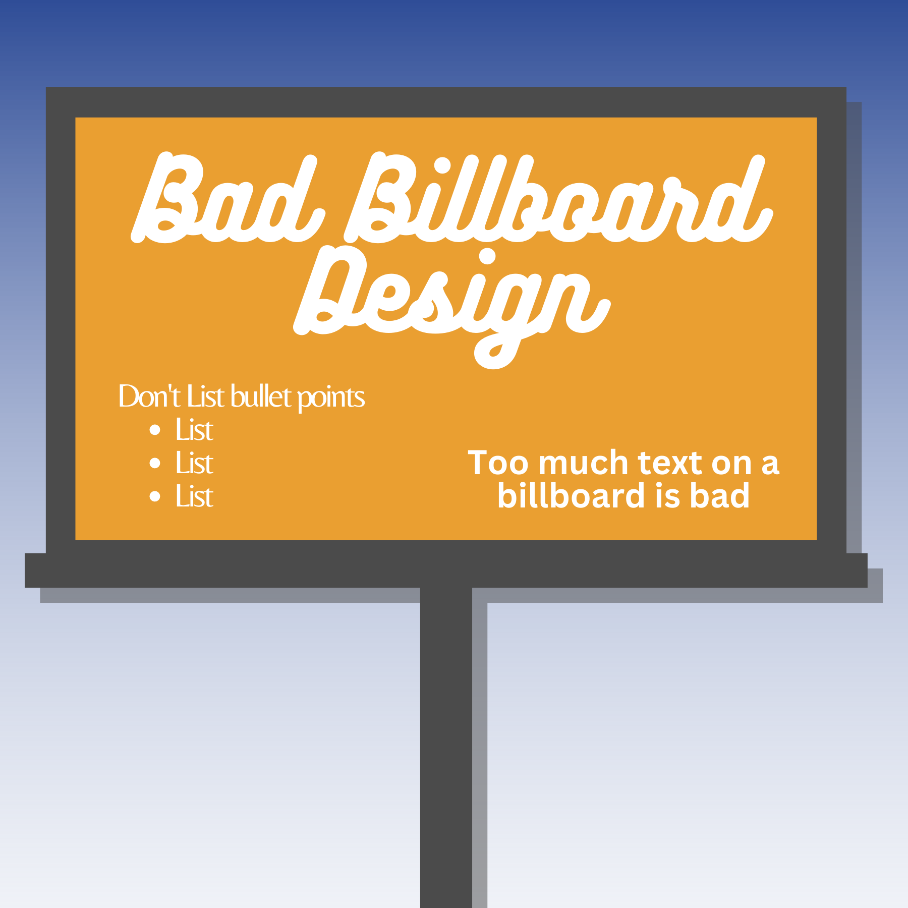
Lists and Bullet Points
A list of bullet points is never usually helpful on a billboard. It might seem counterintuitive but most of the time listing the products and services you are offering will not enhance your message. For example, if John Smith Plumbing lists on their billboard that they repair & replace water lines, clean drains & sewers, test water quality, and offer septic services, that’s wasting space on the design because most people will already assume that a plumbing company would offer those services. If they had a plumbing problem they would likely search online for the company and the website will tell them what services they offer, the billboard doesn’t need to.
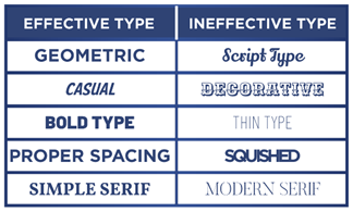
Use of Script Type Fonts
There are few exceptions when stylized script fonts are acceptable on billboards, or in any ad. Fancy fonts take too much time to decipher and readers won’t offer you their precious time to read a message locked up in a funky font – no matter how fun the font looks or how it was used in a logo. Choose fonts with some brand characteristics that won’t sacrifice readability. Fonts that can be read, will be read, so give your potential customers the opportunity to engage with the right choice of font.
 Use of Colors that Don’t Contrast
Non-contrasting colors lack attraction quality and make your billboard copy hard to read. If an advertiser has a blue line of text on a green background almost no one will be able to read it. The same goes for green text on a red background which will create an uncomfortable vibration effect. It is always wiser to stick with colors like blue on white, white on black, red on white, etc.
Use of Too Much Text
Advertisers may want to list a lot of information on their billboards to give the customer as much information as possible. However, if there is too much text, it cannot be organized and your opportunity to create a hierarchy of read order with larger and smaller font sizes, diminishes to using the same size of text for all the information, reducing engagement. Often billboards really don’t need much more than 7 words! The name of the company and maybe a tagline or other blurb is enough. In the internet age people will naturally search online for the company name so even addresses so phone numbers on billboards are obsolete. Billboards are a visual medium, there to communicate your brand. If your message is focused, chances are your brand is too.
Steer clear of these four mistakes and your billboard designs will be readable and more effective! For more resources on how to design billboards check out our Creative page [link].
If you are interested in advertising on one of our billboards call us at 800-221-4114 or email us at meadow@meadowoutdoor.com!